A Little Bit About Me
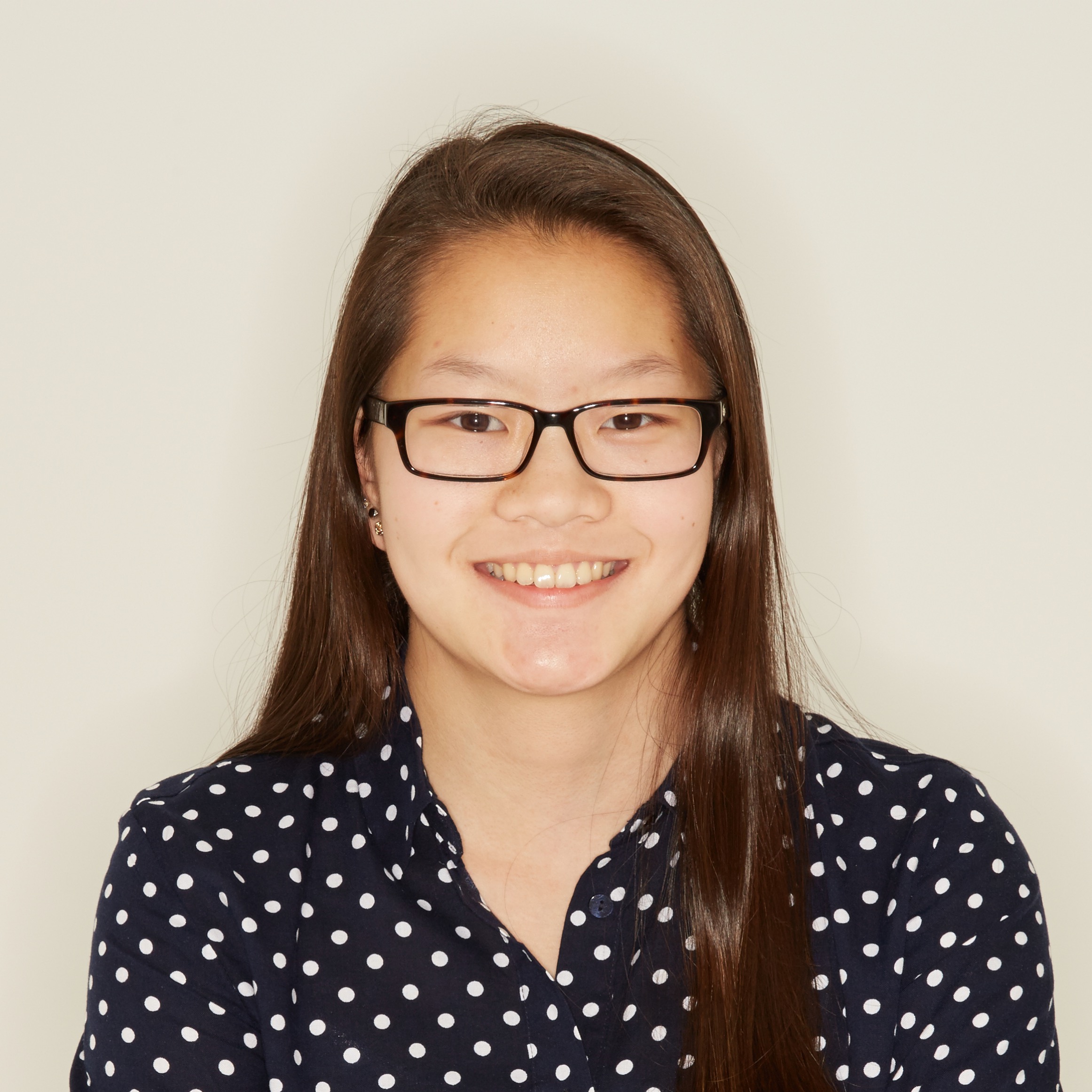
Hey! My name is Brittany and I'm a web developer with a passion for front end development and design. I'm currently a third year student at
Northeastern University pursuing a degree in information science with a minor in interaction design. I aspire toward a career that will allow me to channel my creativity through crafting beautiful software and engaging experiences.
When I'm not on the computer, I enjoy snowboarding, swimming, and petting dogs.
TL;DR? Self Proclamations:
Web Developer
UX Enthusiast
Snowboarder
What I Do
Design
Design isn't just what a product looks like and feels like on the outside. Design encompasses the internal functionality of a product as well as the overall user experience. I strive to design interfaces and experiences that people can enjoy on all digital mediums.
Development
With a strong foundation in computer science, I'm passionate about web design and development, and interested in mobile app development. As I grow as a developer, I hope to write clean, readable code that can be used by others and leveraged to create beautiful software.
Involvement
At Northeastern, I'm currently the web chair for nuWiT (NU Women in Tech) as well as a Teaching Assistant for the undergrad HCI course. Previously, I've been involved with the club water polo team, the resident student association, and the ski and snowboard club.
Check out my résumé!
CourseSource
Web App
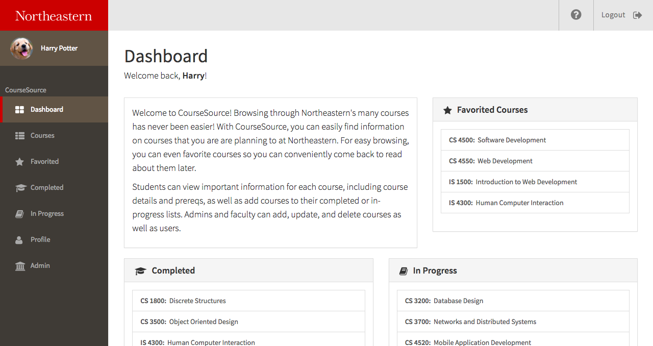
CourseSource is a web application that was built with the MEAN stack for my web development class. I wanted to build this web app to help Northeastern Students have a better experience and more functionalities while browsing the courses offered at Northeastern, especially during registration season. I'm sure many Northeastern students would agree with me that our student portal is in need of a major upgrade, and this web app is just a small example of what our student portal could be like.
Feedback Loop
Final Project
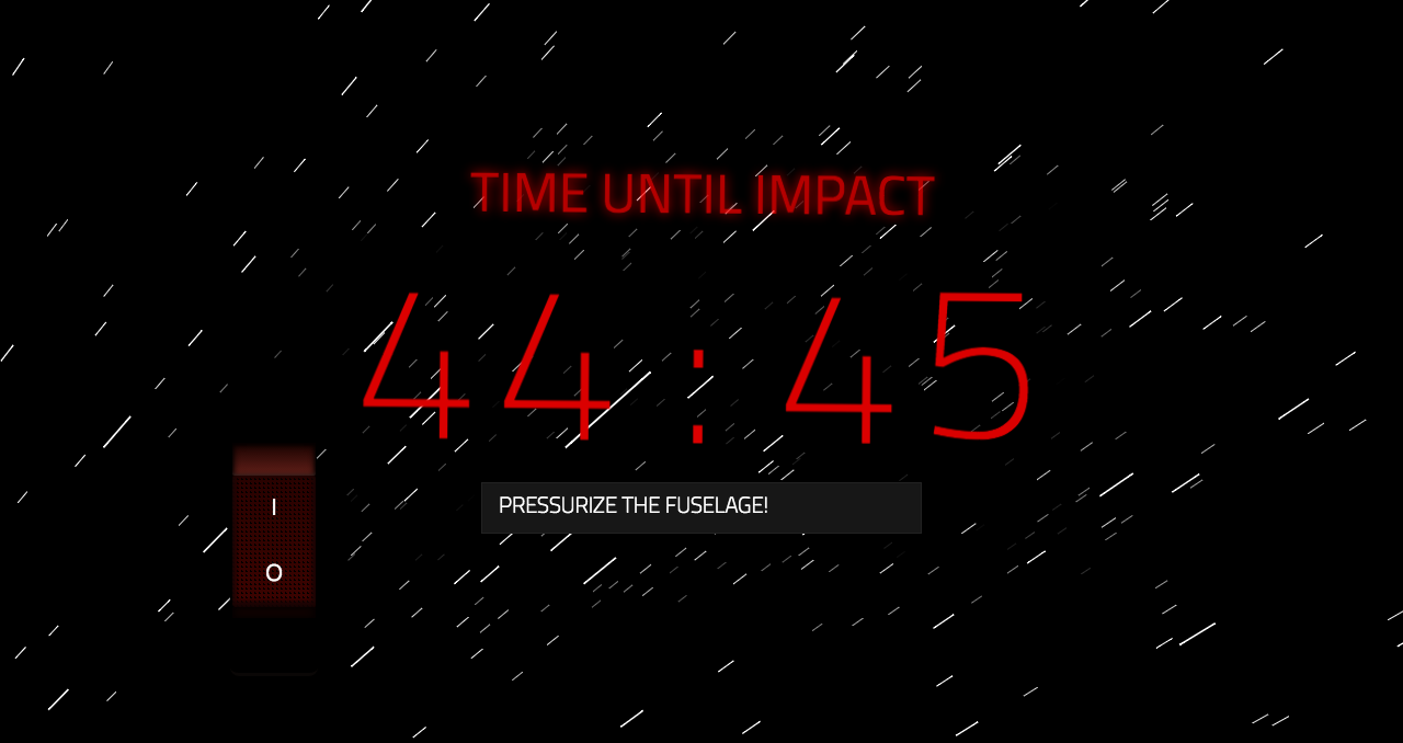
This site was my final project for 5D Foundations: Experience and Drawing. Dubbed "The Emotion Machine", the goal for the project was to use HTML and CSS to create a website which elicits an emotion from the user's interaction with it or engages its user with a particular sort of experience in mind.
Note: For an optimal experience, use chrome with your sound on
Warning: Very resource heavy — efficiency & optimization was definitely not a concern for this project.
Web Development Homepage
Landing Page
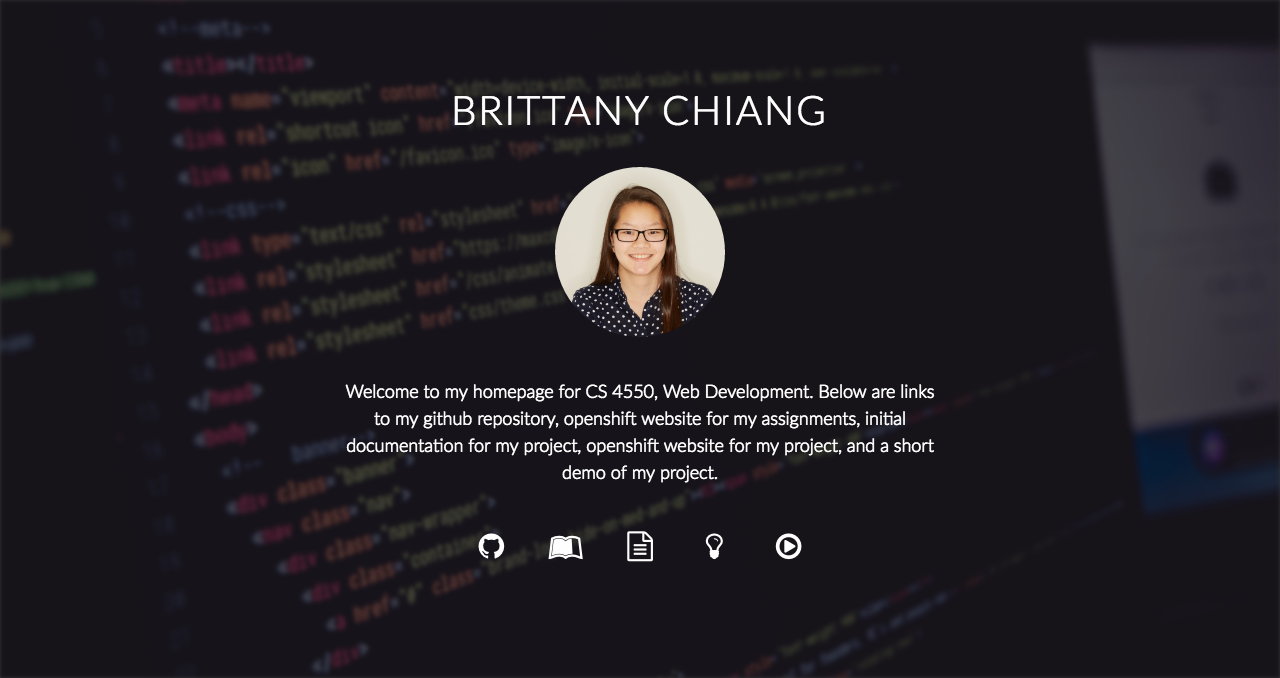
This was a very simple landing page I made for my web development class, hosted on Openshift. It contains a small blurb and the various links required by the professor.
Note: The live assignment is not working due to having to remove functionality from the assignment to make my final project run smoothly.
Fontipsums
Website
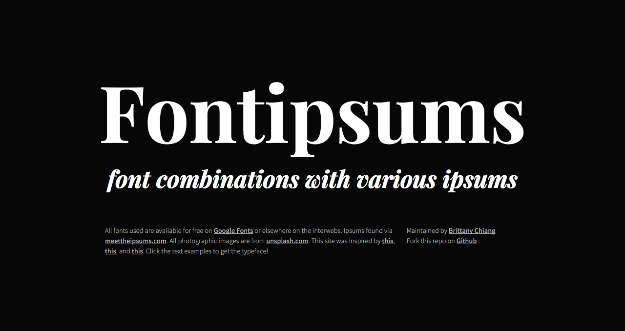
I really enjoy typography and recently became semi-obssessed with discovering new font pairings. I whipped up this simple website to display some of my favorite pairings combined with some fun lorem ipsum variations I found on the web.
Northeastern University Women in Tech
Club Website
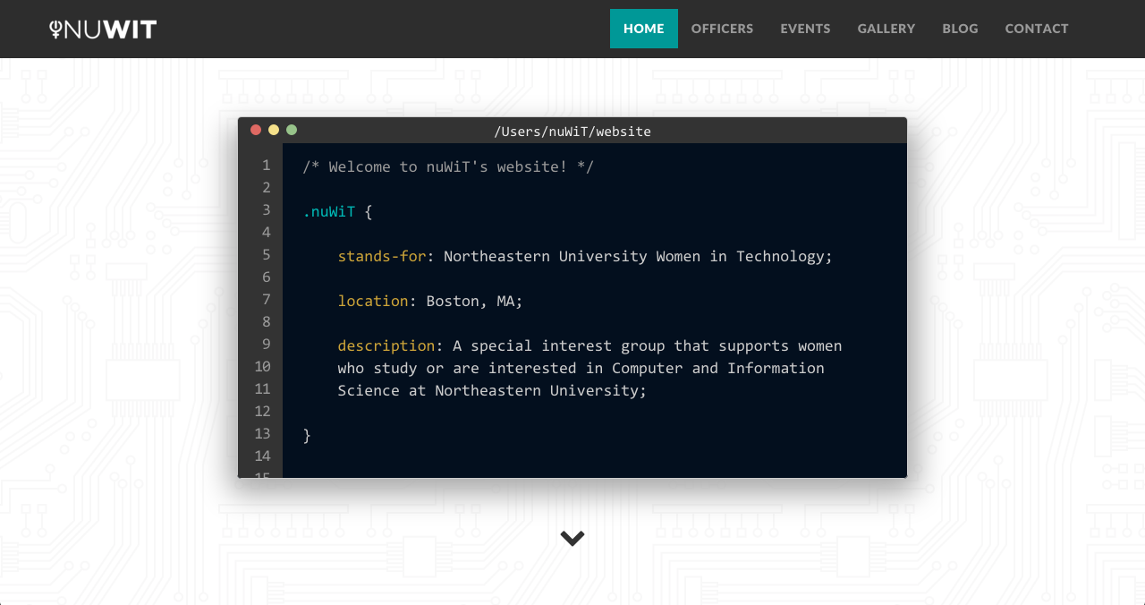
While serving on the e-board as web chair for Northeastern University Women in Technology (NU WiT), I did a complete overhaul on the club website. I designed and built the new website from the ground up. I was responsible for the upkeeping and maintainence of the site.
One Card For All
Mullen's Holiday Card 2015
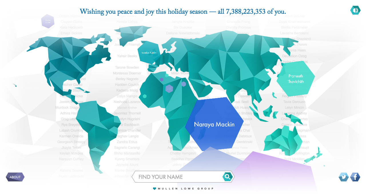
In the spirit of wishing the world peace and joy during the 2015 holiday season, Mullen built a site around an algorithm that generates a holiday greeting to each and every person on the planet. We also accounted for newcomers being added at an amazing rate. Overall, the website is a tranquil, animated experience. As new names appear, visitors can watch them fall, like snowflakes, onto a stylized world map. Users can also find their own name and see it as part of the world collective.
Check out this short video describing the project!
Medicine and the Military
Website
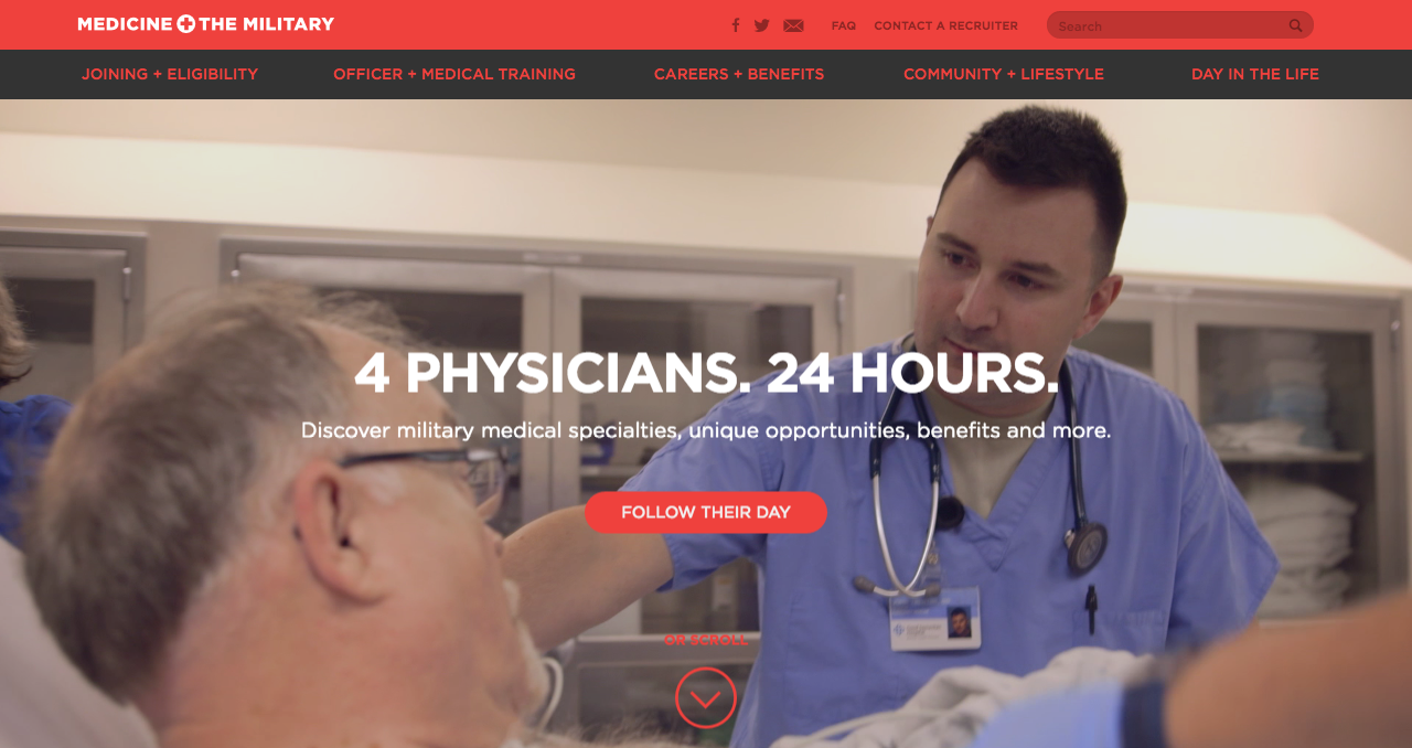
Medicine and the Military is one of the Department of Defense sites I was involved in working on while at Mullen. I worked on various elements of the website, including the full bleed header video, many design tweaks, and the overall experience in general.
JetBlue HumanKinda
Tumblr Site
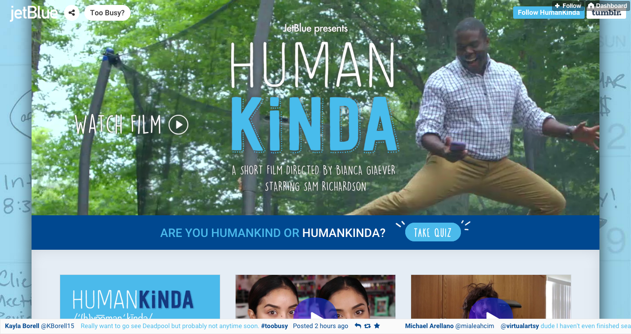
At Mullen, I played a major role in the development and design of this Tumblr site to complement JetBlue's new HumanKinda documentary. The site houses the video documentary at the top, the many graphics created by Mullen for the campaign, and an interactive quiz to determine how "HumanKinda" you are.
Read more about this project on AdWeek, Fast Company, and Digiday!
U.S. Cellular Landing Pages
Static Template Promo Sites
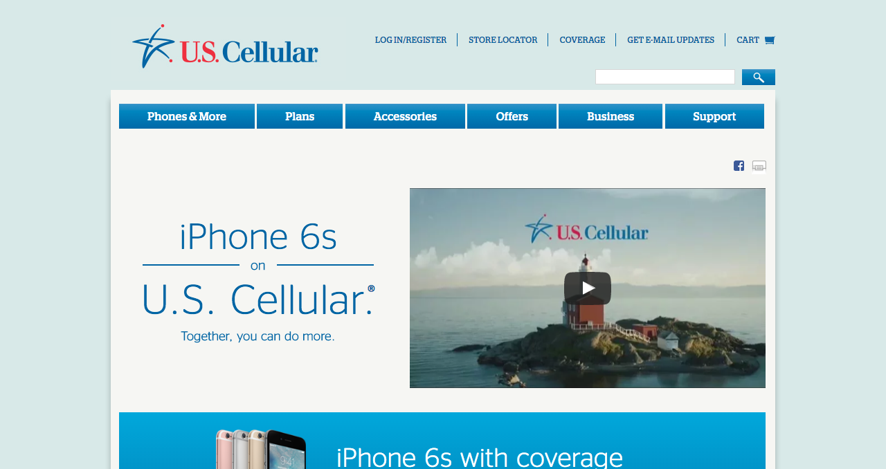
At Mullen, I was resonsible for the development of several of U.S. Cellular's landing pages. Each landing page was for a different campaign, and each page lived in U.S. Cellular's static template.
A few pages I built can be found here, here, and here.
Mullen Display Screens
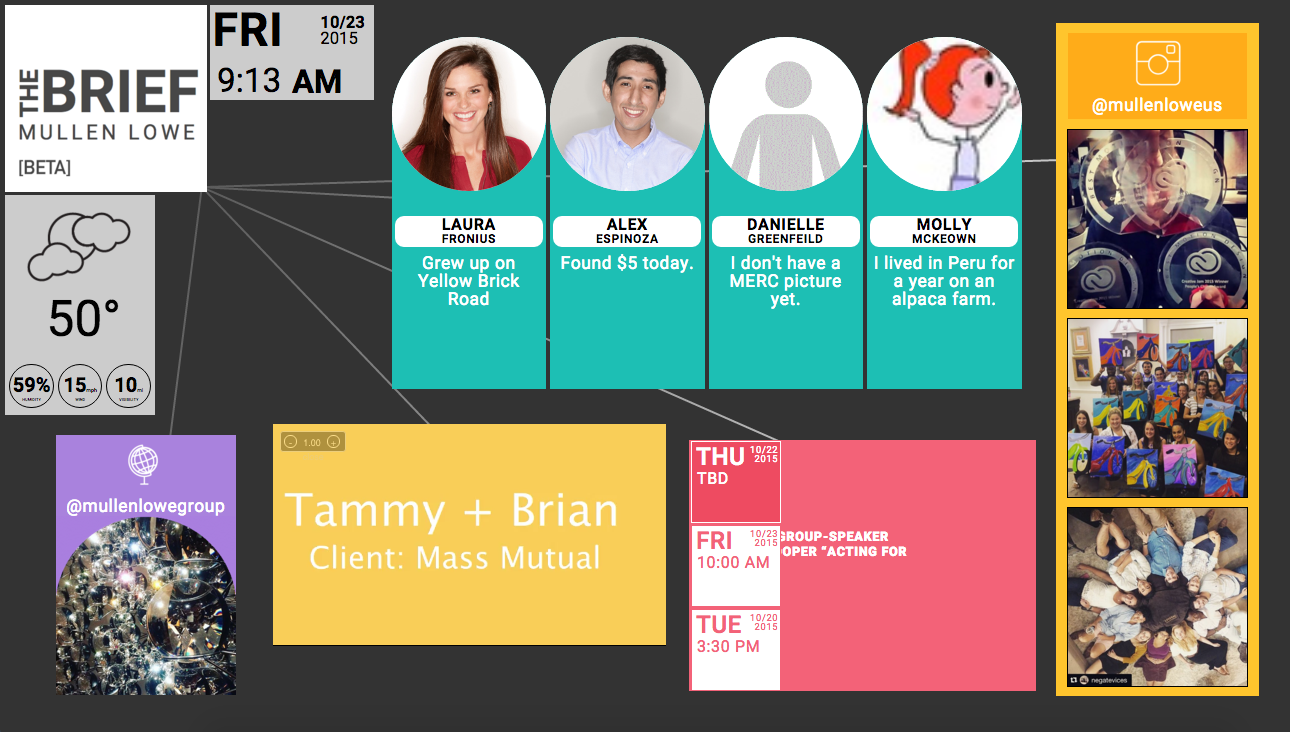
I was involved in the prototyping and initial development of Mullen Display Screens, which was an in-house project at Mullen Lowe's Boston office. This site is displayed on various TV screens around the office as an convenient way to keep employees and guests informed about what goes on at Mullen Lowe. With a Wordpress backend, it's easy for Mullen employees to maintain and update the information displayed by the site.
Lovesac
Tumblr Site
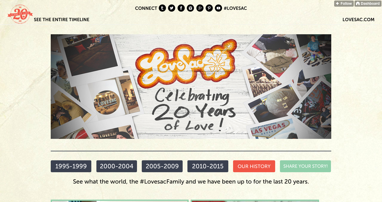
For Lovesac's 20th anniversary, Mullen built this Tumblr timeline site to document Lovesac's history juxtaposed with different cultural trends and pop culture throughout the years. I inherited the code for this shortly before launch, and was responsible for finishing the development on a tight deadline, as well as handling hotfixes.
MullenLoweUS.com
Mullen Lowe's Website
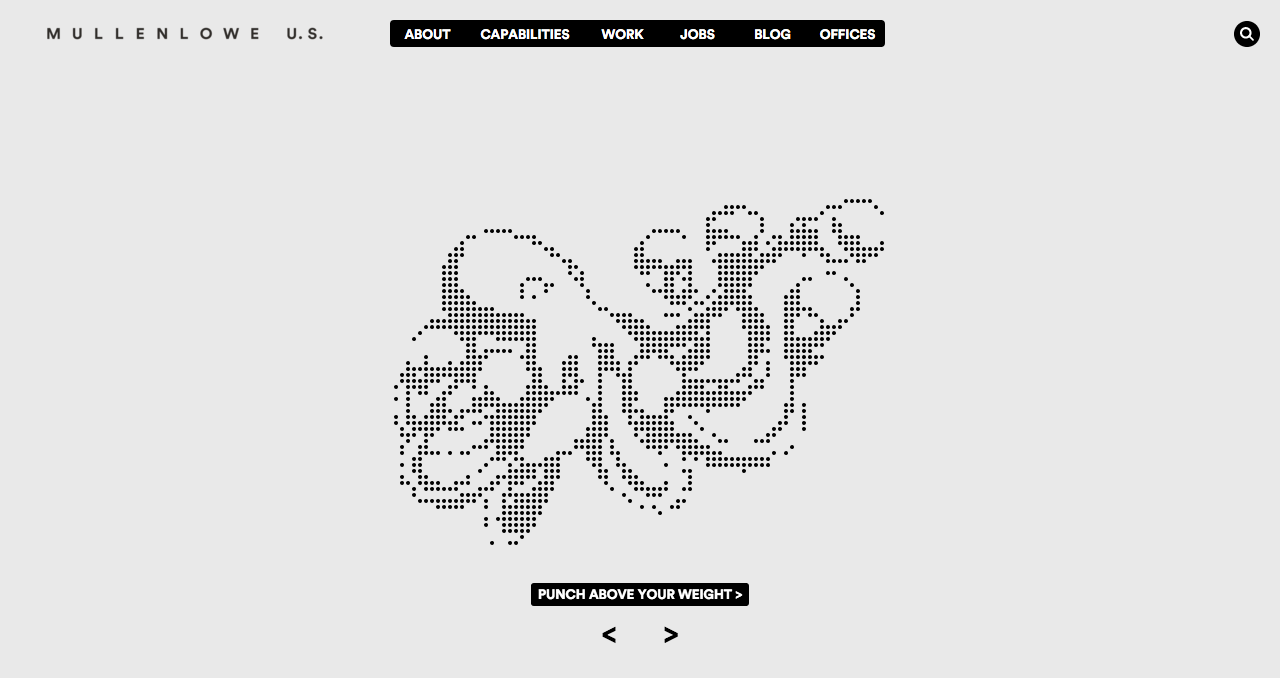
In the beginning of my co-op at Mullen, I tackled and fixed many major bugs and blockers for the company website. I worked with digital producers to create a site style guide and optimized the homepage particle image across all browsers.
Bookmarks
A Compilation of Front End Dev Bookmarks
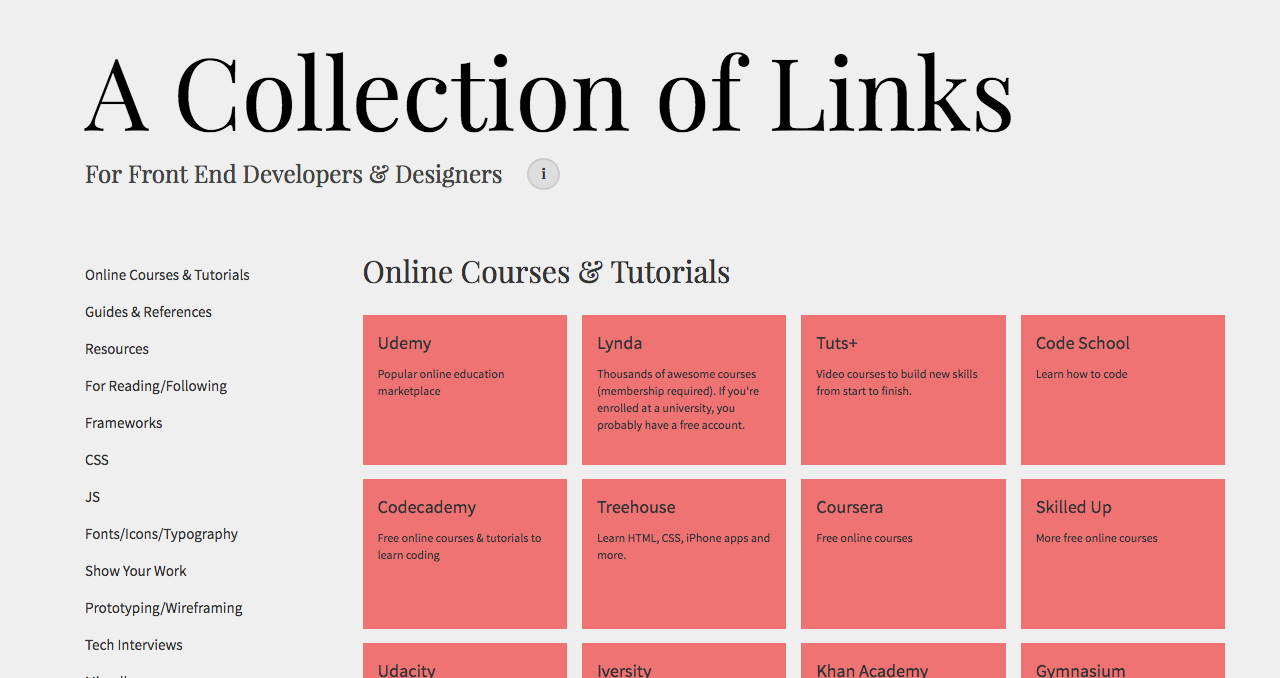
One day I realized my bookmarks folder was overflowing and disorganized. So, I decided to make what I had always hoped my bookmarks folder to look like. This site is essentially a visualization of my bookmarks folder, and also a resource for other developers and designers. This site is mainly for my personal reference, but hopefully, other people find it useful.
NOTE: Optimized for desktop only.
Calendr
All-In-One Calendar/Scheduling Web App
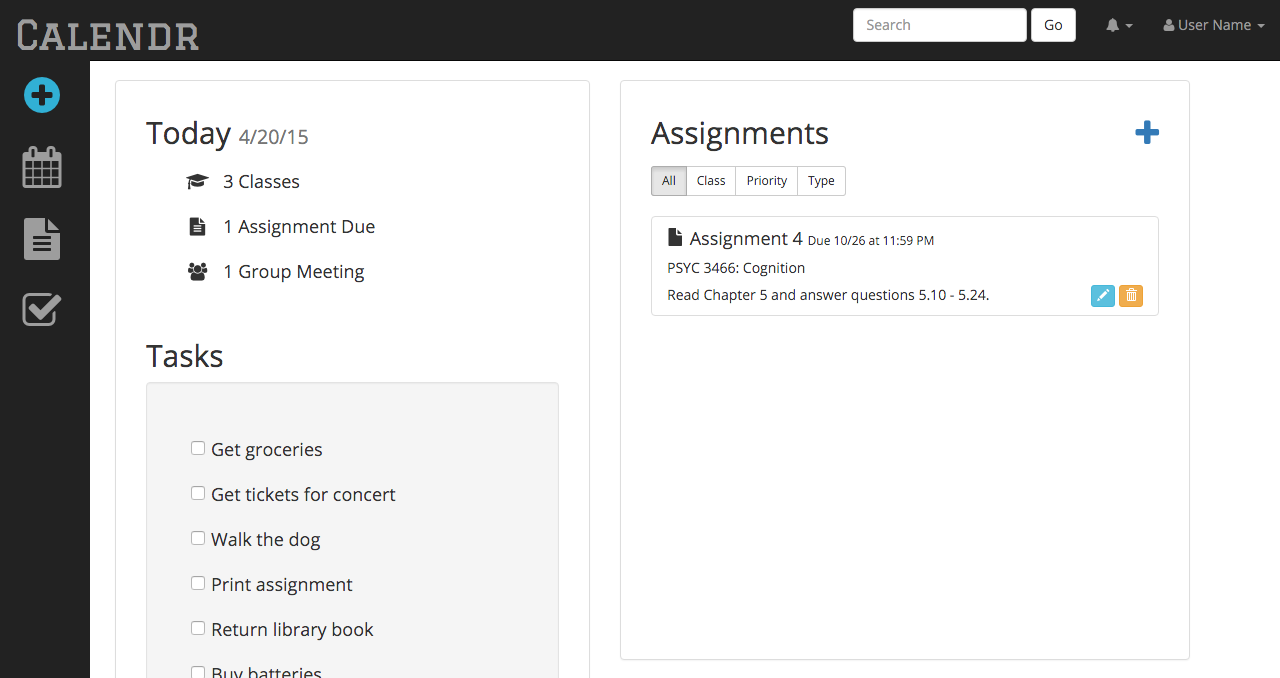
While taking Northeastern's Human Computer Interaction Course, my team and I built a prototype of a web application called Calendr to streamline and mitigate the number of applications that students use to manage their lives. We conceptualized, tested, and developed an all-in-one calendar/homework assignment/to-do list application designed specifically for students. For the purposes of our course, we only implemented a prototype of the front end, which we did with HTML, CSS, jQuery, JavaScript, and the bootstrap framework.
Read about the steps we took to create the final product here.
HCI Course Website
Homework Submission Website
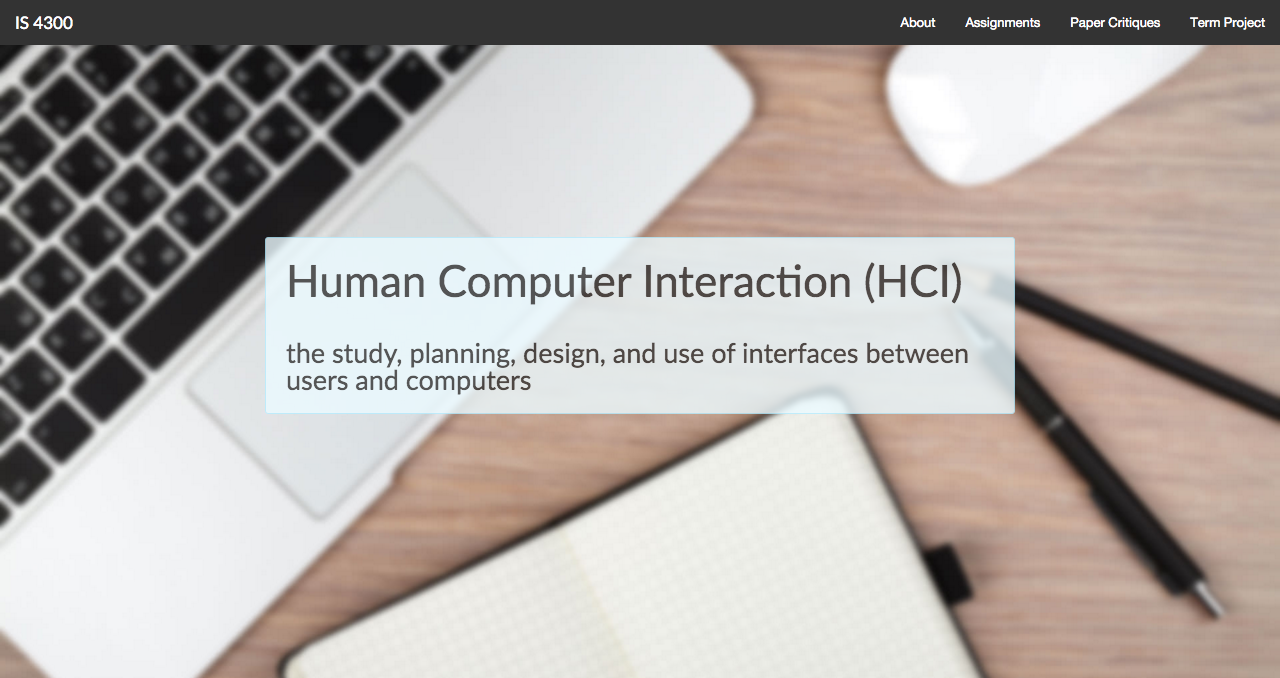
This was the simple homework submission website that I created for my human computer interaction class in the spring of 2015. Built using using HTML, CSS, and the foundation framework by Zurb. It is where you can find my homework assignments, paper critiques, and group project assignments.
Oblivion Themes
Custom Tumblr Themes & Theme Blog
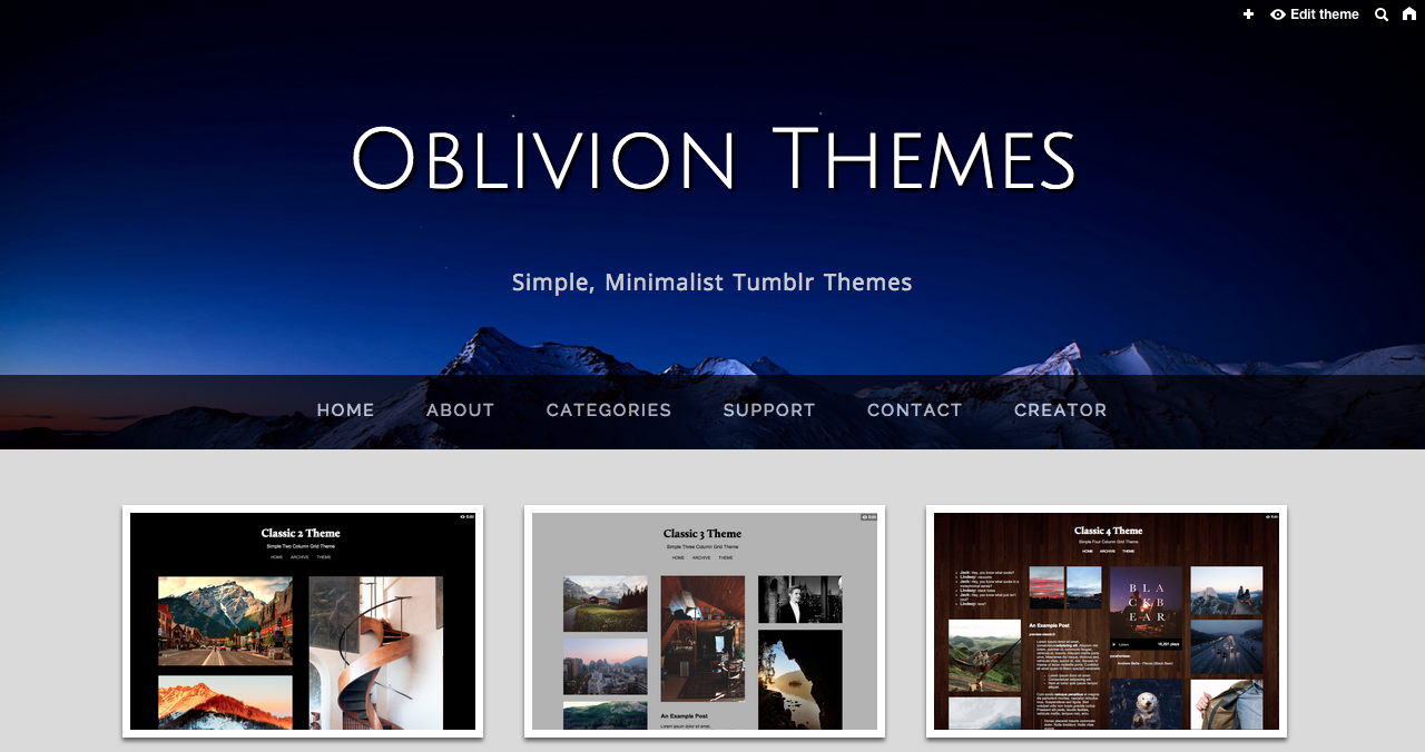
In my spare time I enjoy designing and developing custom Tumblr themes for free. Oblivion Themes is a theme blog that I created to showcase and open source my custom themes. Creating these themes are a productive way for me to keep coding in front end languages and learn new tricks in my free time. I haven't released any new themes recently, but I hope and plan on creating many more themes in the future.
Get In Touch!
Whether you have an idea for a project or just want to chat, feel free to shoot me an email!
